Text alignment
Align text blocks with the following classes.
Left aligned text .text-left
Left aligned text
{: .text-left}
Center aligned text. .text-center
Center aligned text.
{: .text-center}
Right aligned text. .text-right
Right aligned text.
{: .text-right}
Justified text. Lorem ipsum dolor sit amet, consectetur adipiscing elit. Pellentesque vel eleifend odio, eu elementum purus. In hac habitasse platea dictumst. Fusce sed sapien eleifend, sollicitudin neque non, faucibus est. Proin tempus nisi eu arcu facilisis, eget venenatis eros consequat.
**Justified text.** Lorem ipsum dolor sit amet, consectetur adipiscing elit. Pellentesque vel eleifend odio, eu elementum purus. In hac habitasse platea dictumst. Fusce sed sapien eleifend, sollicitudin neque non, faucibus est. Proin tempus nisi eu arcu facilisis, eget venenatis eros consequat.
{: .text-justify}
Figures and figure alignment
Position images with the following classes.
A regular figure with no alignment specified
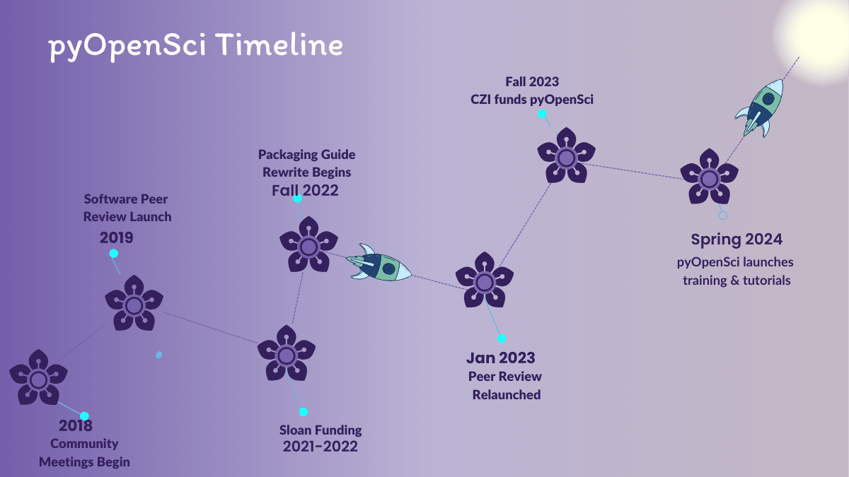
The code for the figure above is below:
<figure>
  <picture>
  <source srcset="/images/pyopensci-general/pyopensci-timeline2019-2024.webp" type="image/webp">
  <img src="/images/pyopensci-general/pyopensci-timeline2019-2024.png" alt="A timeline showing the growth of pyOpenSci from 2019 to 2024.">
  <figcaption>Growth of pyOpenSci from 2019 to 2024</figcaption>
  </picture>
</figure>
Figure – align center

The image above is centered using align-center.
<figure class="align-center">
  <picture>
  <source srcset="/images/pyopensci-general/pyopensci-timeline2019-2024.webp" type="image/webp">
  <img src="/images/pyopensci-general/pyopensci-timeline2019-2024.png" alt="A timeline showing the growth of pyOpenSci from 2019 to 2024.">
  <figcaption>Growth of pyOpenSci from 2019 to 2024</figcaption>
  </picture>
</figure>
Figure – align left

The rest of this paragraph is filler for the sake of seeing the text wrap around the 150×150 image, which is left aligned. There should be plenty of room above, below, and to the right of the image. Just look at him there — Hey guy! Way to rock that left side. I don’t care what the right aligned image says, you look great. Don’t let anyone else tell you differently.
<figure class="align-left">
  <picture>
  <source srcset="/images/pyopensci-general/pyopensci-timeline2019-2024.webp" type="image/webp">
  <img src="/images/pyopensci-general/pyopensci-timeline2019-2024.png" alt="A timeline showing the growth of pyOpenSci from 2019 to 2024.">
  <figcaption>Growth of pyOpenSci from 2019 to 2024</figcaption>
  </picture>
</figure>
You can also adjust the width inline:
<figure class="align-left">
  <picture>
  <source srcset="/images/pyopensci-general/pyopensci-timeline2019-2024.webp" type="image/webp">
  <img src="/images/pyopensci-general/pyopensci-timeline2019-2024.png" alt="A timeline showing the growth of pyOpenSci from 2019 to 2024." style="width: 50%;">
  <figcaption>Growth of pyOpenSci from 2019 to 2024</figcaption>
  </picture>
</figure>
Figure – align right
Below is a right aligned image

And now we’re going to shift things to the right align. Again, there should be plenty of room above, below, and to the left of the image. Just look at him there — Hey guy! Way to rock that right side. I don’t care what the left aligned image says, you look great. Don’t let anyone else tell you differently.
The html looks like this:
<figure class="align-right">
  <picture>
  <source srcset="/images/pyopensci-general/pyopensci-timeline2019-2024.webp" type="image/webp">
  <img src="/images/pyopensci-general/pyopensci-timeline2019-2024.png" alt="A timeline showing the growth of pyOpenSci from 2019 to 2024.">
  <figcaption>Growth of pyOpenSci from 2019 to 2024 Growth of pyOpenSci from 2019 to 2024 Growth of pyOpenSci from 2019 to 2024 Growth of pyOpenSci from 2019 to 2024</figcaption>
  </picture>
</figure>
Figure – full extending outside of the current area
The image below should extend outside of the parent container on right.

<figure class="full">
  <picture>
  <source srcset="/images/pyopensci-general/pyopensci-timeline2019-2024.webp" type="image/webp">
  <img src="/images/pyopensci-general/pyopensci-timeline2019-2024.png" alt="A timeline showing the growth of pyOpenSci from 2019 to 2024.">
  <figcaption>Growth of pyOpenSci from 2019 to 2024 Growth of pyOpenSci from 2019 to 2024 Growth of pyOpenSci from 2019 to 2024 Growth of pyOpenSci from 2019 to 2024</figcaption>
  </picture>
</figure>
Blockquote styles
Regular blockquote
> This entire effort underscores the power of community when guided in
> the right direction, showcasing how collective effort can drive
> meaningful progress.
{: .highlight-quote }
This entire effort underscores the power of community when guided in the right direction, showcasing how collective effort can drive meaningful progress.
Fancy blockquote
> This entire effort underscores the power of community when guided in
> the right direction, showcasing how collective effort can drive
> meaningful progress.
{: .highlight-quote }
This entire effort underscores the power of community when guided in the right direction, showcasing how collective effort can drive meaningful progress.
Fancy blockquote magenta & purple variants
> This entire effort underscores the power of community when guided in
> the right direction, showcasing how collective effort can drive
> meaningful progress.
{: .highlight-quote .magenta }
This entire effort underscores the power of community when guided in the right direction, showcasing how collective effort can drive meaningful progress.
> This entire effort underscores the power of community when guided in
> the right direction, showcasing how collective effort can drive
> meaningful progress.
{: .highlight-quote .purple }
This entire effort underscores the power of community when guided in the right direction, showcasing how collective effort can drive meaningful progress.
Quotes using include files
You can also create blockquotes using include files. Below is a green and magenta version of the same quote
{% include pyos-blockquote.html quote="[*I want to... *] Streamline the development of good quality, socially responsible, and easily shareable software." author="Anonymous" event="AGU 2019 Townhall" class="highlight magenta" %}
[*I want to... *] Streamline the development of good quality, socially responsible, and easily shareable software.
{% include pyos-blockquote.html quote="[*I want to... *] Streamline the development of good quality, socially responsible, and easily shareable software." author="Anonymous" event="AGU 2019 Townhall" class="highlight purple" %}
[*I want to... *] Streamline the development of good quality, socially responsible, and easily shareable software.
The default color for the quotes is the pyos teal green.
{% include pyos-blockquote.html quote="[*I want to... *] Streamline the development of good quality, socially responsible, and easily shareable software." author="Anonymous" event="AGU 2019 Townhall" class="highlight" %}
[*I want to... *] Streamline the development of good quality, socially responsible, and easily shareable software.
Quotes in notice blocks
<div class="notice">

{% include pyos-blockquote.html quote="[*I want to... *] Streamline the development of good quality, socially responsible, and easily shareable software." author="Anonymous" event="AGU 2019 Townhall" class="highlight" %}

</div>
[*I want to... *] Streamline the development of good quality, socially responsible, and easily shareable software.
Buttons
Make any link standout more when applying the .btn .btn--primary classes.
<a href="#" class="btn btn--primary">Link Text</a>
| Button Type | Example | Class | Kramdown |
|---|---|---|---|
| Default | Text | .btn |
[Text](#link){: .btn} |
| Primary | Text | .btn .btn--primary |
[Text](#link){: .btn .btn--primary} |
| Success | Text | .btn .btn--success |
[Text](#link){: .btn .btn--success} |
| Warning | Text | .btn .btn--warning |
[Text](#link){: .btn .btn--warning} |
| Danger | Text | .btn .btn--danger |
[Text](#link){: .btn .btn--danger} |
| Info | Text | .btn .btn--info |
[Text](#link){: .btn .btn--info} |
| Inverse | Text | .btn .btn--inverse |
[Text](#link){: .btn .btn--inverse} |
| Light Outline | Text | .btn .btn--light-outline |
[Text](#link){: .btn .btn--light-outline} |
| Button Size | Example | Class | Kramdown |
|---|---|---|---|
| X-Large | X-Large Button | .btn .btn--primary .btn--x-large |
[Text](#link){: .btn .btn--primary .btn--x-large} |
| Large | Large Button | .btn .btn--primary .btn--large |
[Text](#link){: .btn .btn--primary .btn--large} |
| Default | Default Button | .btn .btn--primary |
[Text](#link){: .btn .btn--primary } |
| Small | Small Button | .btn .btn--primary .btn--small |
[Text](#link){: .btn .btn--primary .btn--small} |
Call out boxes (notices)
You can create a basic notice or call out box for a pargraph by adding {: .notice} to the line immediately below the paragraph.
**Technical and social skills go hand in hand.** Open source communities are most productive when contributors and maintainers recognize this balance between the technical and social skills associated with contributing.
{: .notice}
Which looks like this rendered:
Technical and social skills go hand in hand. Open source communities are most productive when contributors and maintainers recognize this balance between the technical and social skills associated with contributing.
There are multiple classes that you can use to modify the background color of the call out block.
| Notice Type | Class |
|---|---|
| Default | .notice |
| Primary | .notice--primary |
| Info | .notice--info |
| Warning | .notice--warning |
| Success | .notice--success |
| Danger | .notice--danger |
| Measure | .notice--measure |
Readable width (.notice--measure)
Use .notice--measure together with .notice (and optionally a color class such as .notice--info) on pages whose front matter includes classes: flowing. It caps the notice to a readable line length and centers it in the column—useful on full-bleed hubs such as Learn, where a plain .notice would otherwise stretch edge to edge.
Short callout text matches the hero column width.
{: .notice .notice--measure }
Color variant example:
**Heads up:** details for people skimming the page.
{: .notice .notice--info .notice--measure }
The measure rules are defined under .flowing in the site CSS, so they do not apply on a normal single-column post unless you add flowing to that page’s classes list.
Watch out! This paragraph of text has been emphasized with the {: .notice--primary} class.
Watch out! This paragraph of text has been emphasized with the {: .notice--info} class.
Watch out! This paragraph of text has been emphasized with the {: .notice--warning} class.
Watch out! This paragraph of text has been emphasized with the {: .notice--success} class.
Watch out! This paragraph of text has been emphasized with the {: .notice--danger} class.
You can also add the .notice class to a <div> element. Notice below that markdown="1" allows you to use markdwon within the html div.
<div class="notice" markdown="1">
You can also add the .notice class to a <div> element.

* Bullet point 1
* Bullet point 2
</div>
To add a heading element to a notice block but ignore in the TOC, use no_toc as a class like this:
<div class="notice--info">
  <h4 class="no_toc">Notice Headline:</h4>
   here is some html text.
</div>
Which will render like this
Notice Headline that won't appear in toc
. You can add more text here tooNotice Headline
Here is some html text.
Here is a list
- item 1
- item 2
- item 3
Testing a div with a h4 header
<div class="notice--info" markdown="1">
#### Notice Headline
{: .no_toc }

This is how you generate a div using markdown

</div>
Using the Kramdown Markdown renderer with Jekyll allows you to add block and inline attributes. This is nice if you want to add custom styling to text and image, and still write in Markdown.
Jekyll 3: Kramdown is the default for jekyll new sites and those hosted on GitHub Pages. Not using Kramdown? That’s OK. The following classes are still available when used with standard HTML.
YouTube
You can use embeds to add a youtube video to a page. You can copy the id from the video url and add it to the include line below. The jekyll will do the rest for you!
{% include video id="n9IZGT4DxDs" provider="youtube" %}
Connect with us!
There are many ways to get involved if you’re interested!
- If you read through our lessons and want to suggest changes, open an issue in our lessons repository here
- Volunteer to be a reviewer for pyOpenSci’s software review process
- Submit a Python package to pyOpenSci for peer review
- Donate to pyOpenSci to support scholarships for future training events and the development of new learning content.
- Check out our volunteer page for other ways to get involved.
You can also:
- Keep an eye on our events page for upcoming training events.
Follow us on social platforms:
If you are on LinkedIn, check out and subscribe to our newsletter.
You can also:
- Check out our Python Package Guide for comprehensive packaging guidance
- Keep an eye on our events page for upcoming training events
